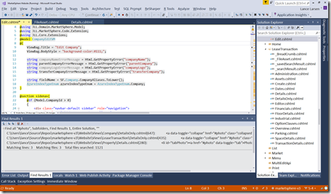
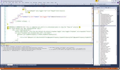
 Is all of the text in the screen-shot to the left readable from the back row when coding live to a room of our fellow developers? Will you be zooming in-and-out constantly?
As presenters – we practice and practice, often spending several weeks or longer working on a single presentations… preparing for demo failure… researching and most importantly learning so we can share and grow our community!
But what we all-to-often DON’T practice is the actual presentation to an audience – or even a simulated audience.
So in this post, we’ll focus on preparing the visual elements and create your own personal Visual Studio “Presentation Theme”!!!
<Note> Please refer to my previous post for effective Zooming-in-and-out: Windows 10 – Best Kept Secrets: Magnifier </Note>
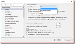
(1) Switch to a Theme that you don’t use – for myself, who uses the “Dark” Theme – I choose the “Blue” theme as my “Presentation Theme”.
Note, general consensus is that a Theme with a white background is easier to read – this is not 100% agreed upon – so use your own judgment here.
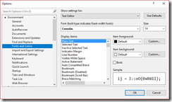
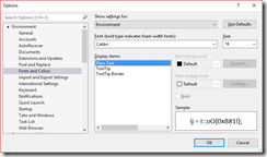
(2) The main things to update are the fonts and font sizes in VS – here is the list of the ones you want to update for your “Presentation Theme”.
Note for me, I find “Calibri” to be a very readable, yet horizontally condensed font – so use that for everything except code.
(A) “[All Text Tool Windows]” — set to “Calibri” and size of “16”
(B) “Text Editor” – set to “Consolas” (the default) and size of “14”
(C) “Environment” – set to “Calibri” and size of “16”
Those are the main ones – you may want to increase others such as “CodeLens” – but you now have a foundation that you can easily switch to when presenting!
Here’s what we end up with… much better – test it out! Can always make the fonts larger depending on the projector / room setup.
If you find other settings that you find helpful to change in your “Presentation Theme” – get them to me!
Good coding!
//Lance
